In The style of "How to Train Your Dragon"
Concept art found here:
_________________________________________
Long Nguyen
Ryan McCafferty
Brian Lamey
___________________________________________
Amanda HILDISHEIM yay!
_________________________________________
Peter Delahunty
Long Nguyen
___________________________________________
Ryan McCafferty
___________________________________________
Brian Lamey
___________________________________________
Amanda HILDISHEIM yay!
____________________________________________
Nancy Martin
______________________________________
Jill Fogarty
______________________________________
Meghan McBride
______________________________________
Kelly Hay-Hambrook
___________________________________________
Julia Dickson
______________________________________
Josie Cable-Russell
_______________________________
Jacelyn McLenaghan
_______________________________
Mitchell Olsen
_________________________________________
James Williston
Peter Delahunty


7 comments:
Brian! Great use of markers! The tonals look really strong. You're really great with them. All the practice is really showing! It's making me want to practice, too! (So thank you!)
(Since we are supposed to say something constructive too...) Maybe next time you could crop out the sketchbook? Unless you like that look. It didn't stand out to me right away, so it's not bad, but it may come off as lazy in the not cropping your image area? I can't think of anything constructive to say about your image itself, though, it looks awesome.
Nancy! I love the colours you picked for your image. Leaving the red lines in gives the drawing a very warm look to it. It looks fresh and appealing in a sketchy/finished way. It's interesting to combine rough with clean and it works really well here. I love the cartoony style you went with. He really looks like he has bulk, and I remember catching a glimpse of it while it was still in your sketchbook and it caught my eye then, too.
For something that could be improved on if you ever did another one? The angle of his right (our left) hand is kind of strange. Maybe draw it so it is more 3/4 than straight at us? That is SUPER nit-picky though. I had to stare at the drawing a really long time to even come up with that!
I'm really impressed with the first years' stuff!! You guys rock. Great work, especially seeing as this is the first couple of weeks using flash! Super awesome!
Hey Jill! I do kinda like the sketchbook look, but you're right it's cleaner without. I feel the drawing jams are a chance to experiment and try new things.
I really like your contributions lately. The rosy look you gave to Angelina Jolie is really nice. Really cool effect.
Nancy, your Viking looks amazing. Really great use of style and rough lines. If we have to offer critiques then maybe clean up the lines. but honestly? I wouldn't touch it a bit, it's beautiful.
Amanda, you have been using a cool sketchy style in Flash I haven't seen you do before. You usually have a clean, thick black line. It is awesome to see you experiment. I dig your work.
Thanks Brian!
I always try to experiment other style's.
BRIAN:
I really like the sketchy feeling of your character. I also like how you stick with the style Tara use for the drawing jam. Plus adding that thick line makes it pop out more of the page. I like it lots.
LONG:
Nice use of colour theory and nice body weight.
KELLY:
I really like how your drawing jam looks cubist.
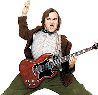
Hey Amanda! I love your Jack Black drawing Jam, it's so well done and it looks just like him! Very nice style, and colors too! :D
And Everyone else did an awesome job as well! They all turned out really great!
THANKS MEGHAN!
I would like to add... Julia I really like the warm analogous you used on Jack Black. Especially, the pink it really pops out the character. Now! I would like to say be careful with the style. The hand doesn't match with the style you use for the face.
I really like the style you chose Kelly, But I think if you maybe fixed up your hand a bit it would look really psychedelic, Awesome job though!
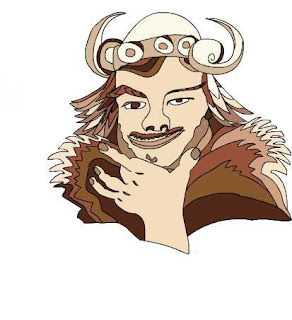
Jill! I really like your nacho Libre. It's very close to the style, with the color and the mustach is Hilarious!
Post a Comment